I collaborated with a design agency called People Interactive to build the information architecture, wireframes, page flows, and style guides that we’d use throughout the project. Furthermore, I was the lead Product designer responsible for all the visual deliverables, including high-fidelity prototypes and style guides.
My role: Product Design / UX / Visual Design
Ux tools: Card sorting, competitive analysis, personas, usability test, heuristic evaluation, and clickable prototype.
Date: May 2015 (3 months of development)
Ux tools: Card sorting, competitive analysis, personas, usability test, heuristic evaluation, and clickable prototype.
Date: May 2015 (3 months of development)
* To comply with my non-disclosure agreement, I have omitted and obfuscated confidential information in this case study. All information in this case study is my own and does not necessarily reflect the views of Vivara or any other partners involved in the project.
____________________________________________
Challenge
Our main goal was to level up Vivara’s website experience to resonate with its premium product's quality and therefore boost engagement.
Business requirements:
⟶ Make the website easy to use for everyone
⟶ Give the users more control over their buying possibilities
⟶ Create a platform that would involve the users on an emotional level
⟶ Create a responsive website that works on any device
⟶ Give the users more control over their buying possibilities
⟶ Create a platform that would involve the users on an emotional level
⟶ Create a responsive website that works on any device
____________________________________________
Discovery
This starting step was all about fleshing out the problem, finding user needs and understanding the audience. So, for that, we made Competitive Analysis, Stakeholders interviews, Card sorting and User interviews.
Competitive and Market Analysis
Brazil’s jewelry market is strongly competitive. We benchmarked ten direct & indirect competitors and created a Feature Analysis that revealed common patterns and best practices. In addition, it helped convince stakeholders on where we should focus.
Competitive Analysis sheet
Identifying our audience
Who are our users? In which context they need our services? What are they looking for? Why? In order to answer those questions and get the first insights into the research, we had to get data.
Firstly, we looked through google analytics reports from the current website. That helped us define some demographics for the audience. Our users were primary Females under 25-34. Furthermore, we launched a screener survey on the website to recruit participants so we could get quantitative data for more accurate questions.
Secondly, to get qualitative and real insights we had to spoke in person with users. So we invited people that use to engage with the brand in social media for an interview. After a quick filtering, to identify those who were real customers we carried out ten interviews by phone and Skype.
Main takeaways
⟶ Females were the primary users.
⟶ Most users preferred doing shopping alone.
⟶ Most people access to see new releases and get info but prefer buying in a local store.
⟶ Instagram was the most popular social media followed by Pinterest.
⟶ Most users preferred doing shopping alone.
⟶ Most people access to see new releases and get info but prefer buying in a local store.
⟶ Instagram was the most popular social media followed by Pinterest.
Personas
Those interviews helped us craft two persona hypothesis based on different archetypes. Through careful analysis, we recognized sufficient behavioral factors to segment the audience. These key points were mainly categorized into moments and motivations. Each user behavior would change entirely accordingly with which moment the person was experiencing. One could access the website in order to buy a gift for a friend, or in another case, simply to see new releases of his favorite brands. All those variables were crucial building the personas that would afterward provide enough empathy to guide towards the entire process.
Proto Personas: Laura and Anna
Testing the current website and finding pain points
We started inspecting the current website doing an expert review. This method worked as a Heuristic Evaluation taking in consideration main usability guidelines walking through the site in the shoes of a typical user. Furthermore, we crafted our first assumptions on how we should improve the website interface-wise and where we should focus while doing the usability tests with actual people.
Establishing a concept: Moments.
We identified during the research that each user has a particular goal while buying jewelry; it’s intimate and emotional. You not only purchase jewelry because of its appearance but also for the sentimental value and as an expression for the moment you’re in it. With that in mind, we decided to suggest a moment-orientated navigation as a key feature for the project. Instead of just navigating through the website by filtering brands, type of materials or collections. What if you navigate through special moments of your life? Those moments are particularly unique chief among them new debutant, graduate, dating, engagement, wedding or even having a child.
Card sorting
We used card sorting exercises to evaluate the information architecture and make sense of the labels organizing the site categories. That is especially handy while defining proper namings for the subcategories under “Moments” due to the fact that it was a fresh concept. Making sure that the naming would be clear to everyone was extremely important. For instance, for that particular audience, what is the best way to label a category meant for Couples? Romance, Lovers Jewelry? After several suggestions of bright names, we decided to go simple and transparent so that the entire audience can understand the labels without a struggle.
Card sorting Session
_____
Experience Design
Hypothesis-driven design
Before start designing, we decided to state a few hypothesis to guide us towards creating a more user-centered design. Each hypothesis meant to address significant pain point found during the early research.
• Users want to feel acquainted before purchasing deluxe products.
• Users want to compare different products on the website easily.
• Users want to favorite/save designs for buying it later.
• Users want to compare different products on the website easily.
• Users want to favorite/save designs for buying it later.
Early sketches exploring concepts and possible design patterns for the three essential pages for the project: Home, Pricing, and Product.
While wireframing we have taken into consideration a huge list of several design patterns and heuristics that are essential for any good e-commerce of success. We drank a huge deal from top e-commerce chief among them Amazon and eBay. It is important to identify what is being done right in the market. Later on, we pieced the design together into a navigable prototype using Axure.
Prototype validation
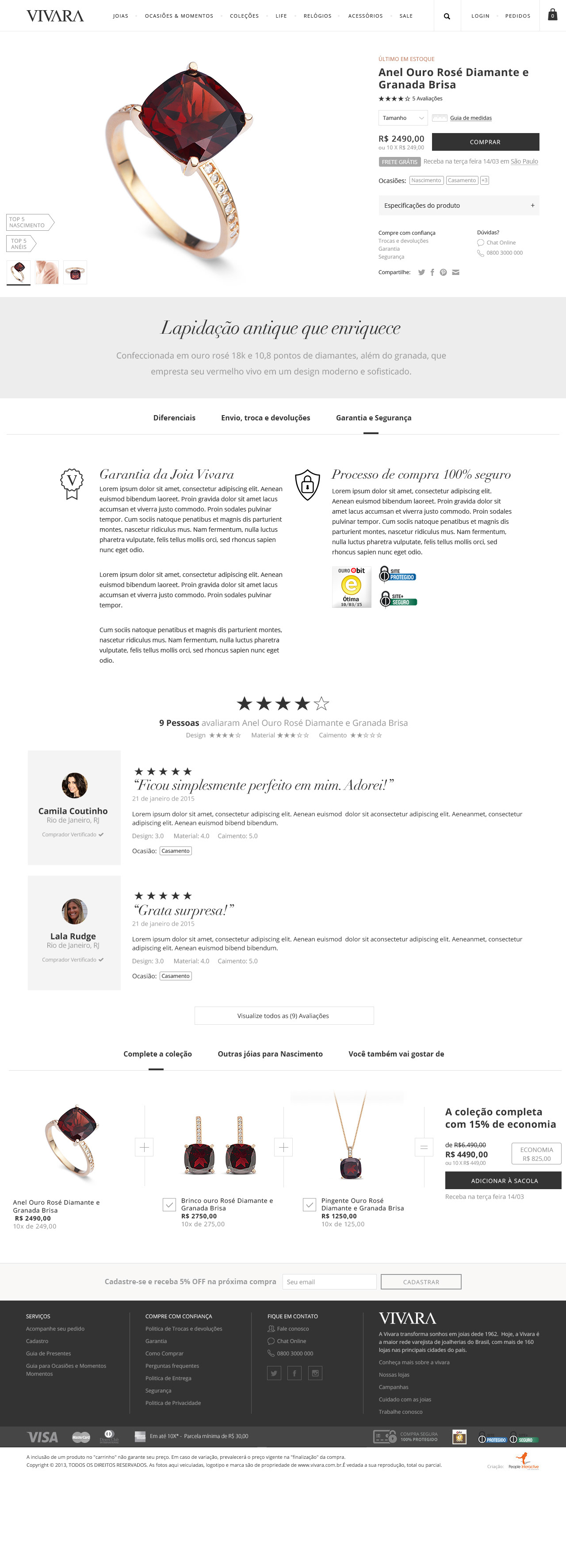
Testing the prototype with users was incredibly meaningful to guide us and validate our assumptions. After a few sessions of the usability test, the interface was transformed even more to address the pain points that arose from the testing.
Top findings:
⟶ 6/7 considered the new search placement on the homepage extremely useful allowing them to quickly find new products.
⟶ 6/7 considered the mega menu as being very useful, especially for navigating between brands and categories.
⟶ 5/7 considered the compare products feature very useful.
⟶ 4/7 users weren't sure what type of collection each product belongs to and wanted more clarity in the materials of each product was made of.
_____
Visual design
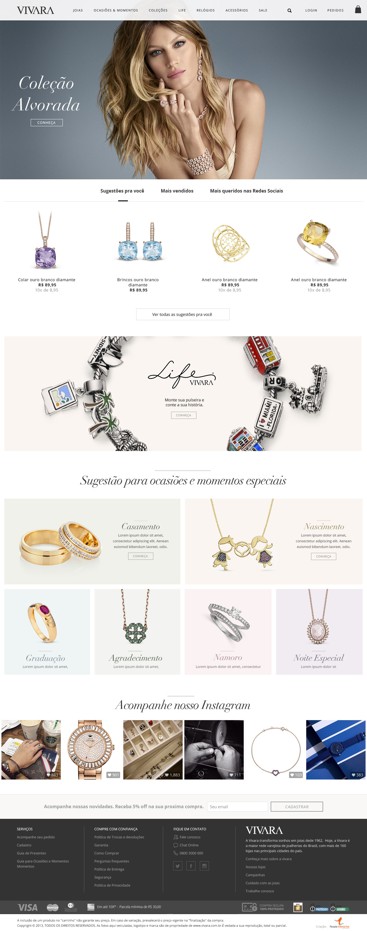
After defining the information architecture, it was time to start working on the styling and look&feel of the page. From the very beginning of the project, we had a pretty clear idea of how the styling should look. Not only respecting the brand guidelines but also following the principles of “Good Design" by Dieter Rams. Like any design project, to craft a proper visual language is crucial.
We started the process by diving into the brand’s current graphical assets so that we could get a sample of the whole system. Secondly, after gathering feedback from stakeholders and some brainstorming sessions, eventually, we put together a mood board that would give a general idea of the particular style and concept that we were aiming towards, as well as respecting the previous look and feel already established.
A solution to multiple profiles
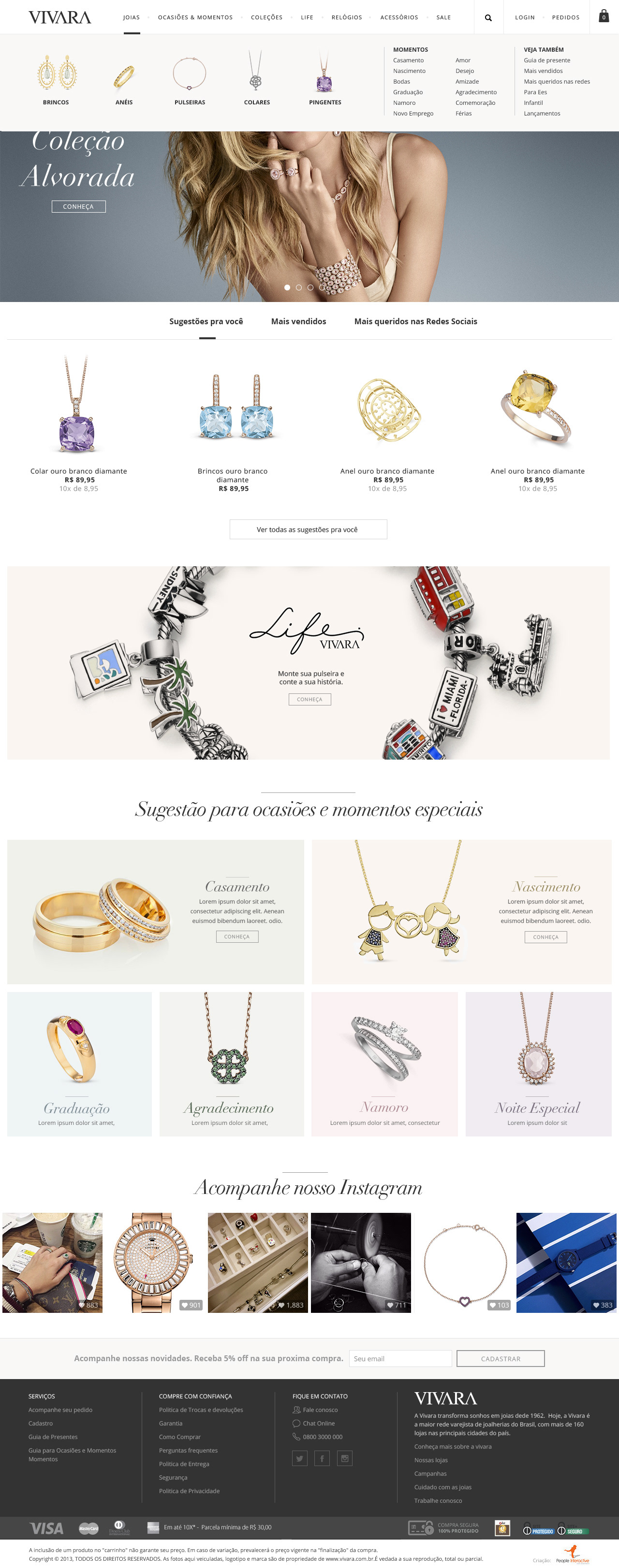
While redesign, we spent a good amount of time on the landing page. We have run multiple rounds of iterations changing various types of hero images and colors.
The goal was to design a clear and intuitive experience and yet emotionally engaging.
Vivara Style Sheet UI KIt

_____
. . .

