
Home


Sequence Design System
How we went from fragmented UIs and siloed design practices to a shared system that scaled across multiple products and teams
OVERVIEW
As Sequence scaled, so did the need for a more unified and purposeful design system. What began as a loose collection of components evolved into a structured initiative to create a scalable, well-documented, and developer-friendly foundation for all product teams.
This revamp wasn’t a dedicated sprint, it was a parallel effort, gradually built alongside other design and product priorities. Over six months, we incrementally evolved the system while shipping features, ensuring it remained grounded in actual use cases.
The project focused on bringing clarity, consistency, and collaboration to our design practices enabling faster decision-making, smoother handoffs, and a shared visual language across teams. It also laid the groundwork for a design system culture rooted in documentation, governance, and continuous evolution.
ROLE
I Led the design system revamp in collaboration with other designers, covering architecture, documentation, Figma optimization, and developer handoffs
TIME
~6 months (designed gradually as a side initiative while supporting other projects)
Problem & Discovery
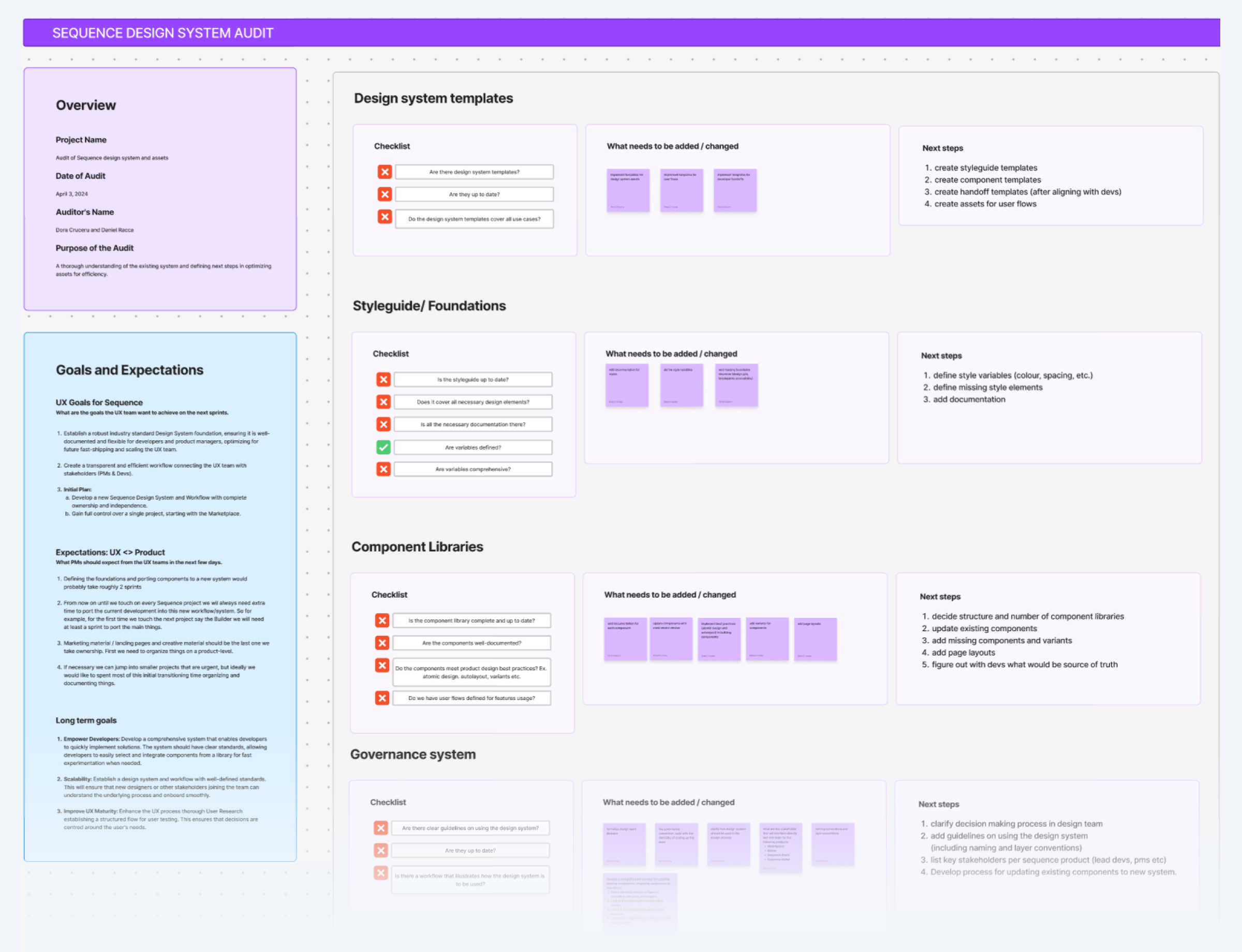
We audited the current design system to understand its problems
The audit revealed a number of critical gaps that made the system difficult to trust, scale, or maintain:
- Templates were missing, outdated, or inconsistently used
- Components had unclear or conflicting variant names
- No shared process existed for proposing or updating parts
- UX handoffs were ad hoc and lacked clear workflows
- Tokens weren’t structured for theming or reuse
- Documentation wasn’t standardized or dev-friendly
Defining the problem:
”How might we build a system that brings order to component maintance and aligns design and dev workflows”
We aligned on next steps...
Our specific actionable next steps were:
- Establishing documentation templates for all components
- Introduce branching workflows in Figma
- Standardize UX ticket handoff templates linked to GitHub issues
- Formalize a governance model for contribution and approval
- Research other established design systems like Apple's human interface guidelines and Google's Material Design.
- Defining a new token structure using Tailwind-based primitives and semantic tokens
Foundations & Framework
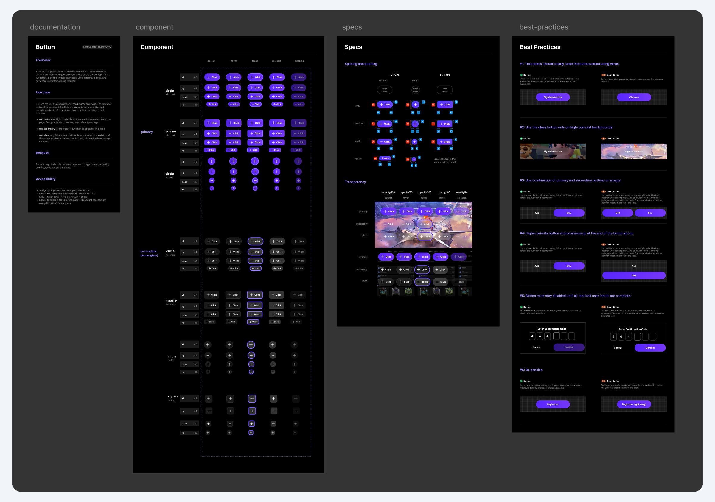
Standardizing every component through a shared documentation template
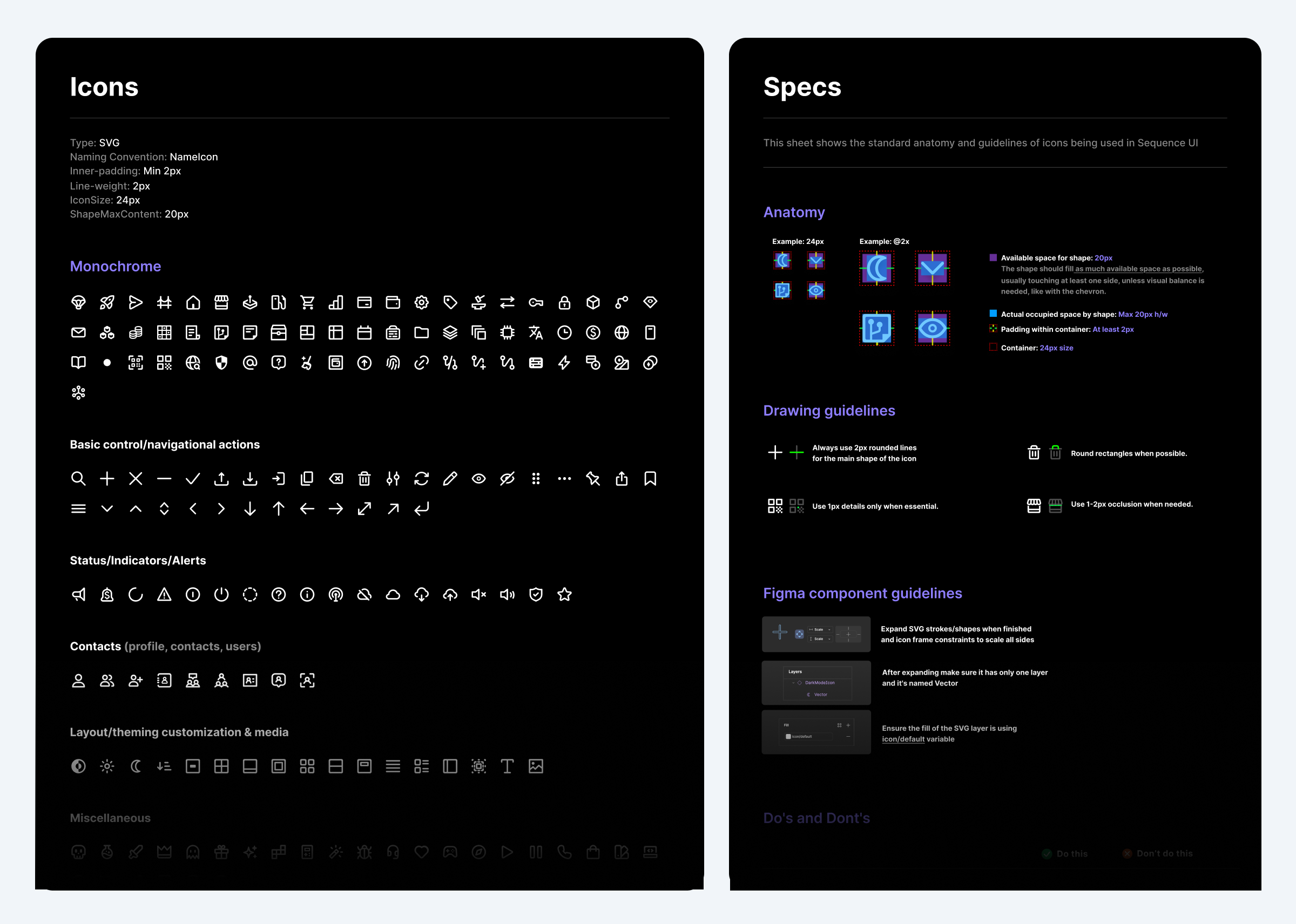
1. 📝 Documentation: Clear overview of usage, behavior, accessibility, and relevant information
2. 💠 Component Sheet: Source of truth for the component and all variants organized by states and variants.
3. 📐 Specs: Padding, layout, and interaction logic ready for dev handoff
4. 🙌 Best Practices: Dos and don’ts with contextual screenshots for visual alignment. Useful not only for developers but also for other designers joining the team.
⭐ Value added: Reduced onboarding time and design ambiguity by making every component follow a consistent, well-documented structure.
Variables & Tokens
By then, the new token feature from Figma was just released and we wanted to use it on our new design system to ensure we can do a smooth transition between dark and light modes.
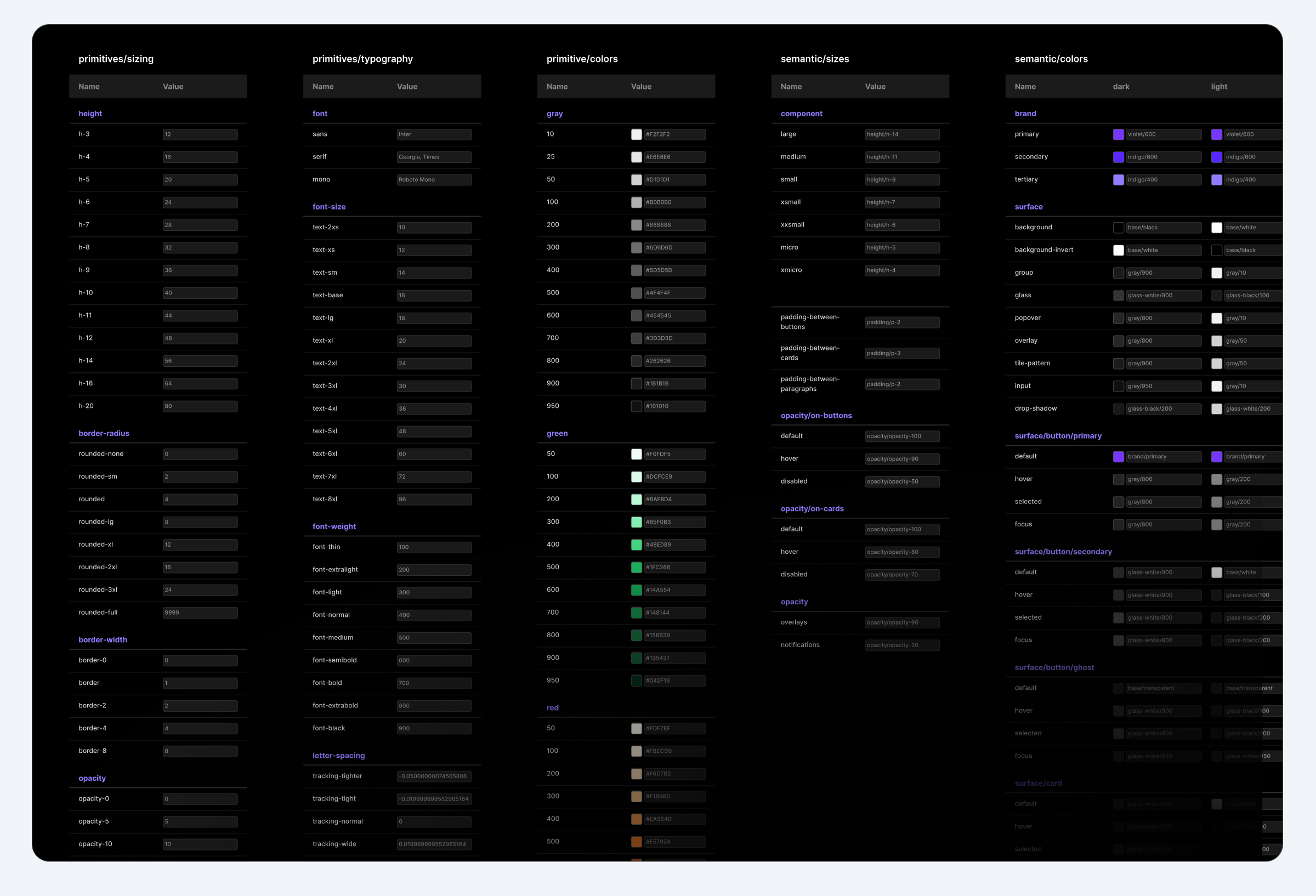
We aligned our tokens with Tailwind to bring consistency and clarity across platforms
In collaboration with our developers, we aligned on a shared system language by adopting Tailwind as the foundation for both code and design. This ensured consistency and improved handoff clarity between teams.
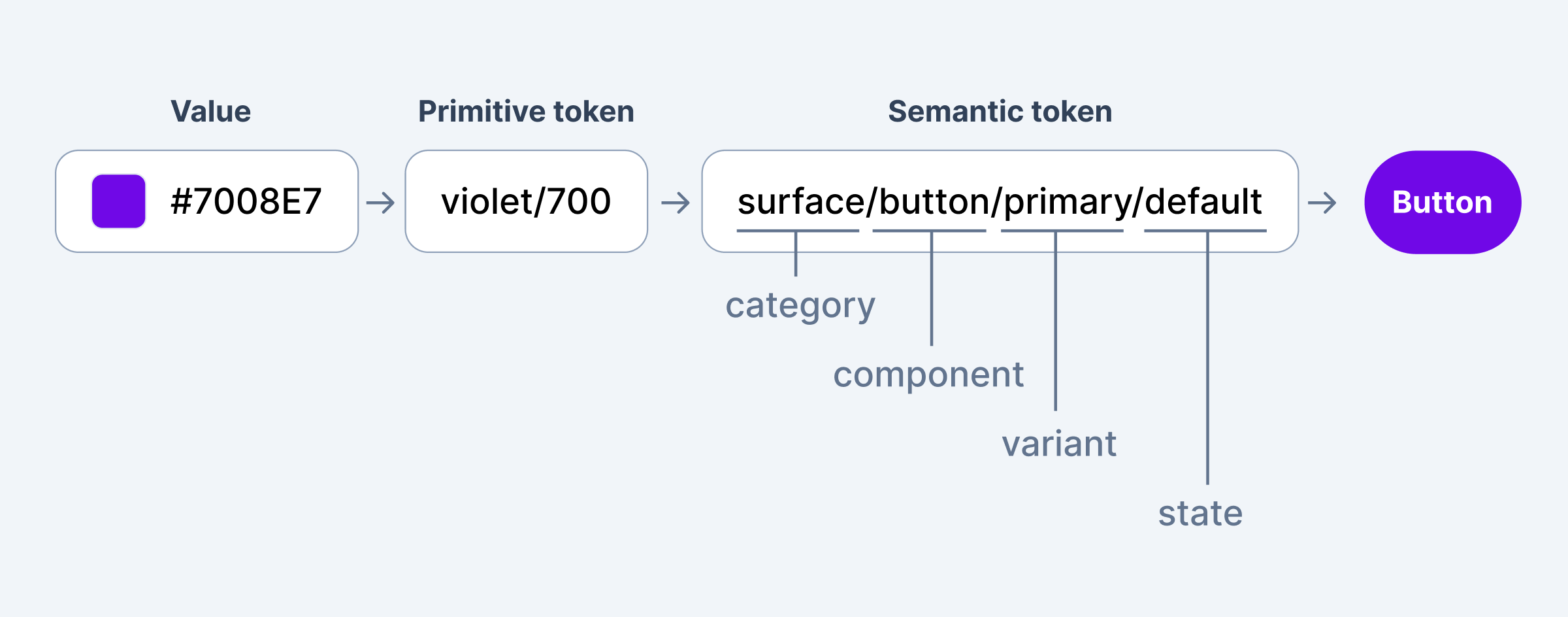
We restructured our variables into two distinct layers:
Primitive tokens – Based on Tailwind conventions: spacing scales, t-shirt sizing, border radii, etc.
Semantic tokens – Used to define purpose-driven styles like primary/secondary colors, input states, and light/dark mode themes.
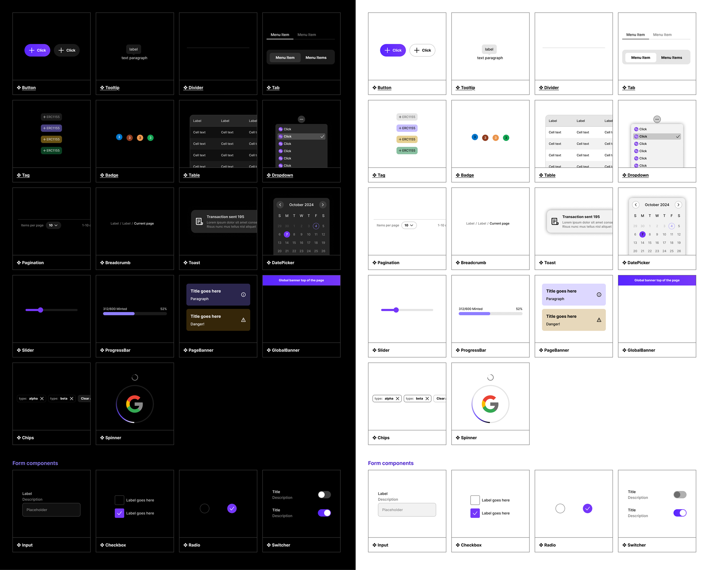
Component improvements
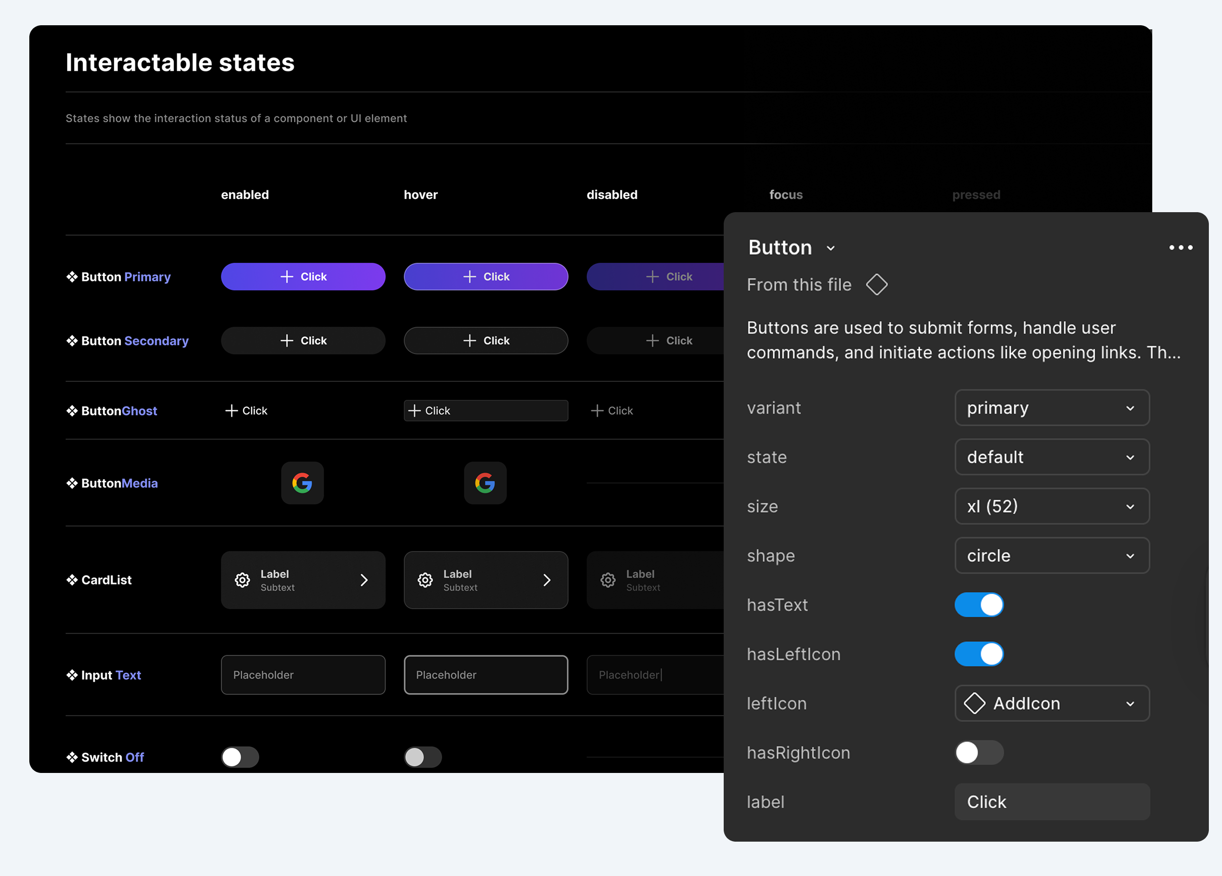
We refactored components using Figma’s best practices
We rebuilt all interactive components with consistent properties, naming logic, and states. Each variant is now cleanly organized using Figma’s structured props, making overrides faster and editing more intuitive.
⭐ Value added: Designers and developers could now work faster with less back-and-forth thanks to cleaner props and predictable interaction logic.
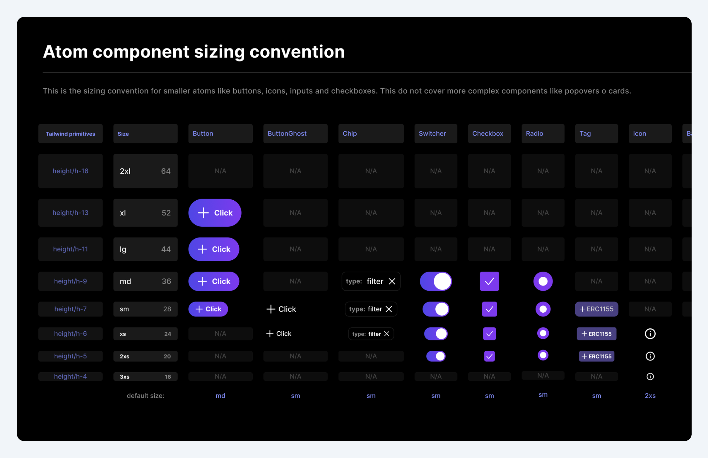
We standardized atomic sizing for consistency and scale
We defined a shared sizing system for buttons, toggles, and icons based on Tailwind conventions. Each size maps to specific dimensions and spacing, ensuring consistency, accessibility, and better alignment across the UI.
⭐ Value added: Made easier to scale across breakpoints and component types.
Governance Workflow
To prevent regressions and keep workflow smooth, we introduced a formal governance model:
🌱 Figma Branching with peer-review for all new component work
🌱 Defined criteria for inclusion (must be atomic or reusable in handoffs)
⭐ Value added: Prevented regressions and design drift by setting clear quality gates and enabling peer-reviewed contributions.
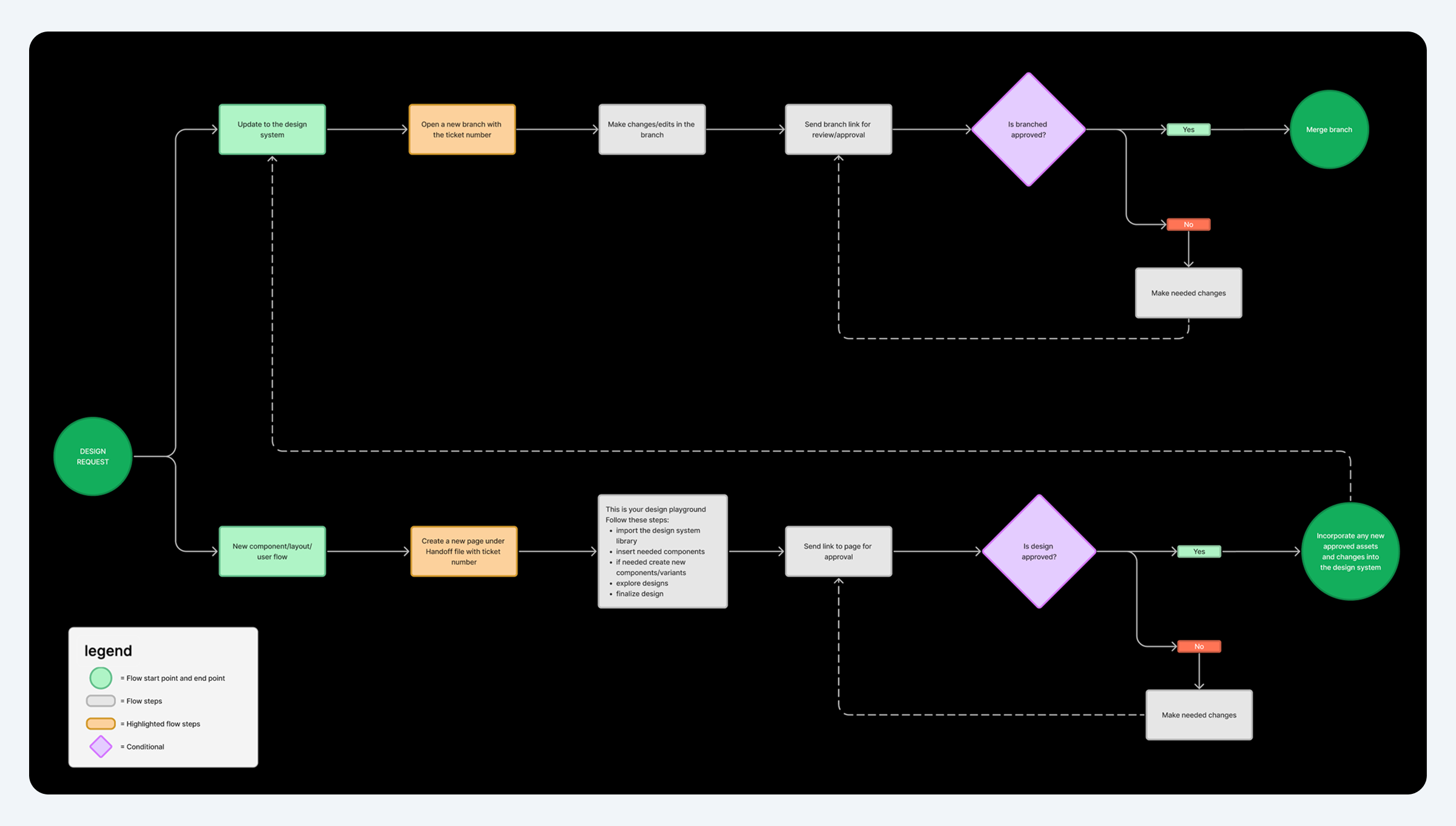
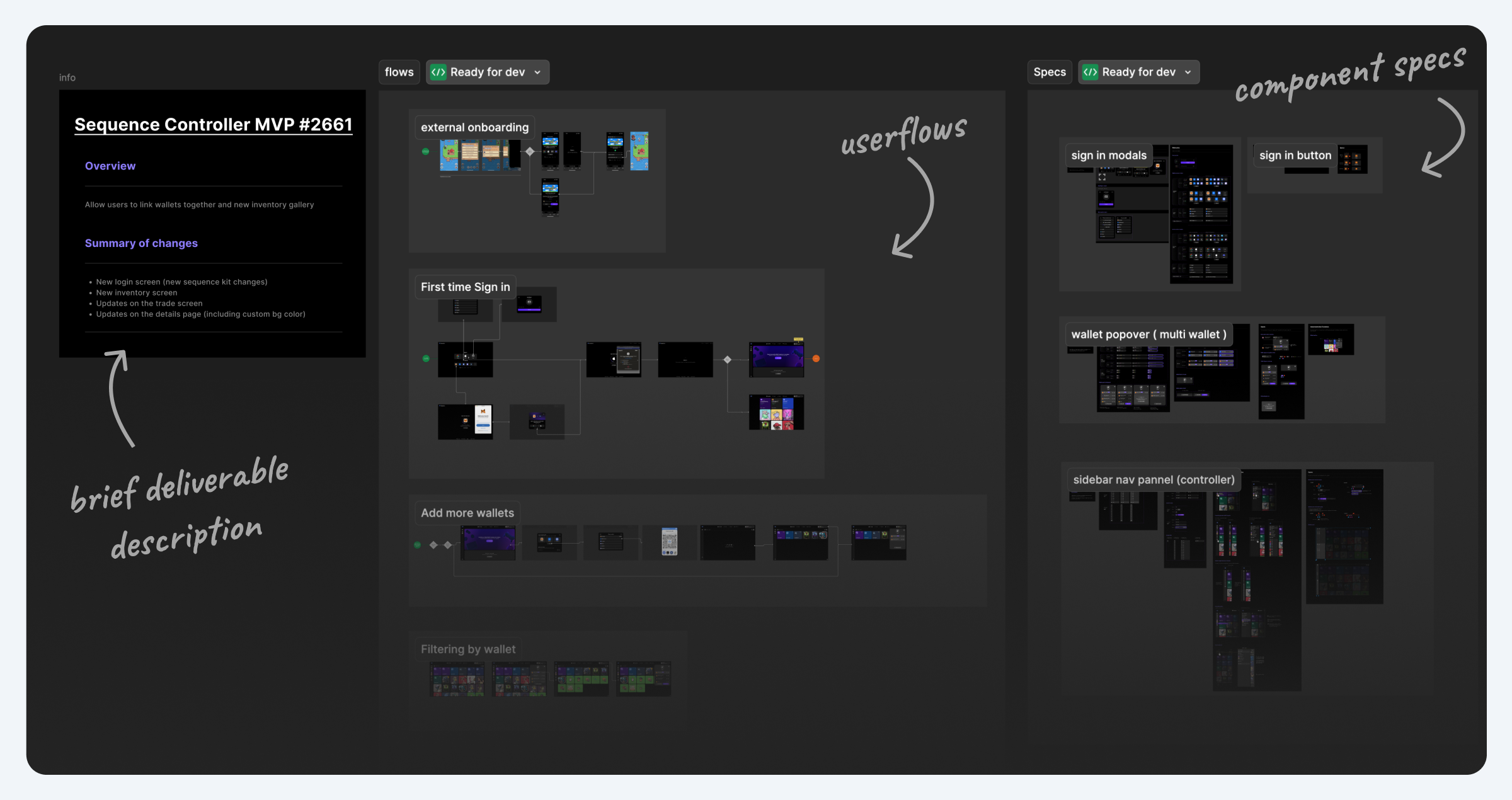
New dev handoff files
We also revamped how design-to-dev handoffs are done.
• Each design handoff is linked to a GitHub ticket for better traceability
• Introduced a handoff template with usage notes, visuals, and context
⭐ Value added: Reduced guesswork for developers by packaging flows, specs, and tickets into a single, ready-for-dev handoff.
Collaboration & Rituals
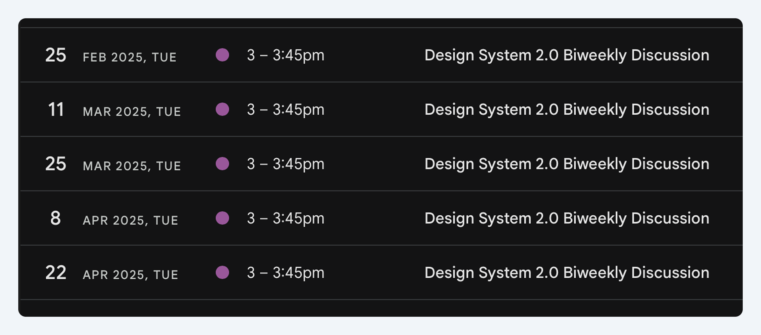
A simple ritual to keep the system evolving
We held a bi-weekly design system sync to review proposals, share feedback, and track design debt. This recurring touchpoint kept the system active, relevant, and collaborative.
Learnings
This project proved that strong documentation and shared structure are essential for scaling design in async environments. With clearer specs and a consistent system, delivery became faster, smoother, and more predictable.
Thank you for reading :)
Back to home
Home
Sequence Design System
How we went from fragmented UIs and siloed design practices to a shared system that scaled across multiple products and teams
OVERVIEW
As Sequence scaled, so did the need for a more unified and purposeful design system. What began as a loose collection of components evolved into a structured initiative to create a scalable, well-documented, and developer-friendly foundation for all product teams.
This revamp wasn’t a dedicated sprint, it was a parallel effort, gradually built alongside other design and product priorities. Over six months, we incrementally evolved the system while shipping features, ensuring it remained grounded in actual use cases.
The project focused on bringing clarity, consistency, and collaboration to our design practices enabling faster decision-making, smoother handoffs, and a shared visual language across teams. It also laid the groundwork for a design system culture rooted in documentation, governance, and continuous evolution.
ROLE
I Led the design system revamp in collaboration with other designers, covering architecture, documentation, Figma optimization, and developer handoffs
TIME
~6 months (designed gradually as a side initiative while supporting other projects)
Problem & Discovery
We audited the current design system to understand its problems
The audit revealed a number of critical gaps that made the system difficult to trust, scale, or maintain:
- Templates were missing, outdated, or inconsistently used
- Components had unclear or conflicting variant names
- No shared process existed for proposing or updating parts
- UX handoffs were ad hoc and lacked clear workflows
- Tokens weren’t structured for theming or reuse
- Documentation wasn’t standardized or dev-friendly
Defining the problem:
”How might we build a system that brings order to component maintance and aligns design and dev workflows”
We aligned on next steps...
Our specific actionable next steps were:
- Establishing documentation templates for all components
- Introduce branching workflows in Figma
- Standardize UX ticket handoff templates linked to GitHub issues
- Formalize a governance model for contribution and approval
- Research other established design systems like Apple's human interface guidelines and Google's Material Design.
- Defining a new token structure using Tailwind-based primitives and semantic tokens
Foundations & Framework
Standardizing every component through a shared documentation template
1. 📝 Documentation: Clear overview of usage, behavior, accessibility, and relevant information
2. 💠 Component Sheet: Source of truth for the component and all variants organized by states and variants.
3. 📐 Specs: Padding, layout, and interaction logic ready for dev handoff
4. 🙌 Best Practices: Dos and don’ts with contextual screenshots for visual alignment. Useful not only for developers but also for other designers joining the team.
⭐ Value added: Reduced onboarding time and design ambiguity by making every component follow a consistent, well-documented structure.
Variables & Tokens
By then, the new token feature from Figma was just released and we wanted to use it on our new design system to ensure we can do a smooth transition between dark and light modes.
We aligned our tokens with Tailwind to bring consistency and clarity across platforms
In collaboration with our developers, we aligned on a shared system language by adopting Tailwind as the foundation for both code and design. This ensured consistency and improved handoff clarity between teams.
We restructured our variables into two distinct layers:
Primitive tokens – Based on Tailwind conventions: spacing scales, t-shirt sizing, border radii, etc.
Semantic tokens – Used to define purpose-driven styles like primary/secondary colors, input states, and light/dark mode themes.
Component improvements
We refactored components using Figma’s best practices
We rebuilt all interactive components with consistent properties, naming logic, and states. Each variant is now cleanly organized using Figma’s structured props, making overrides faster and editing more intuitive.
⭐ Value added: Designers and developers could now work faster with less back-and-forth thanks to cleaner props and predictable interaction logic.
We standardized atomic sizing for consistency and scale
We defined a shared sizing system for buttons, toggles, and icons based on Tailwind conventions. Each size maps to specific dimensions and spacing, ensuring consistency, accessibility, and better alignment across the UI.
⭐ Value added: Made easier to scale across breakpoints and component types.
Governance Workflow
To prevent regressions and keep workflow smooth, we introduced a formal governance model:
🌱 Figma Branching with peer-review for all new component work
🌱 Defined criteria for inclusion (must be atomic or reusable in handoffs)
⭐ Value added: Prevented regressions and design drift by setting clear quality gates and enabling peer-reviewed contributions.
New dev handoff files
We also revamped how design-to-dev handoffs are done.
• Each design handoff is linked to a GitHub ticket for better traceability
• Introduced a handoff template with usage notes, visuals, and context
⭐ Value added: Reduced guesswork for developers by packaging flows, specs, and tickets into a single, ready-for-dev handoff.
Collaboration & Rituals
A simple ritual to keep the system evolving
We held a bi-weekly design system sync to review proposals, share feedback, and track design debt. This recurring touchpoint kept the system active, relevant, and collaborative.
Learnings
This project proved that strong documentation and shared structure are essential for scaling design in async environments. With clearer specs and a consistent system, delivery became faster, smoother, and more predictable.
Thank you for reading :)
Back to home
Home

Sequence Design System
How we went from fragmented UIs and siloed design practices to a shared system that scaled across multiple products and teams
OVERVIEW
As Sequence scaled, so did the need for a more unified and purposeful design system. What began as a loose collection of components evolved into a structured initiative to create a scalable, well-documented, and developer-friendly foundation for all product teams.
This revamp wasn’t a dedicated sprint, it was a parallel effort, gradually built alongside other design and product priorities. Over six months, we incrementally evolved the system while shipping features, ensuring it remained grounded in actual use cases.
The project focused on bringing clarity, consistency, and collaboration to our design practices enabling faster decision-making, smoother handoffs, and a shared visual language across teams. It also laid the groundwork for a design system culture rooted in documentation, governance, and continuous evolution.
ROLE
I Led the design system revamp in collaboration with other designers, covering architecture, documentation, Figma optimization, and developer handoffs
TIME
~6 months (designed gradually as a side initiative while supporting other projects)
Problem & Discovery
We audited the current design system to understand its problems
The audit revealed a number of critical gaps that made the system difficult to trust, scale, or maintain:
- Templates were missing, outdated, or inconsistently used
- Components had unclear or conflicting variant names
- No shared process existed for proposing or updating parts
- UX handoffs were ad hoc and lacked clear workflows
- Tokens weren’t structured for theming or reuse
- Documentation wasn’t standardized or dev-friendly
Defining the problem:
”How might we build a system that brings order to component maintance and aligns design and dev workflows”
We aligned on next steps...
Our specific actionable next steps were:
- Establishing documentation templates for all components
- Introduce branching workflows in Figma
- Standardize UX ticket handoff templates linked to GitHub issues
- Formalize a governance model for contribution and approval
- Research other established design systems like Apple's human interface guidelines and Google's Material Design.
- Defining a new token structure using Tailwind-based primitives and semantic tokens
Foundations & Framework
Standardizing every component through a shared documentation template
1. 📝 Documentation: Clear overview of usage, behavior, accessibility, and relevant information
2. 💠 Component Sheet: Source of truth for the component and all variants organized by states and variants.
3. 📐 Specs: Padding, layout, and interaction logic ready for dev handoff
4. 🙌 Best Practices: Dos and don’ts with contextual screenshots for visual alignment. Useful not only for developers but also for other designers joining the team.
⭐ Value added: Reduced onboarding time and design ambiguity by making every component follow a consistent, well-documented structure.
Variables & Tokens
By then, the new token feature from Figma was just released and we wanted to use it on our new design system to ensure we can do a smooth transition between dark and light modes.
We aligned our tokens with Tailwind to bring consistency and clarity across platforms
In collaboration with our developers, we aligned on a shared system language by adopting Tailwind as the foundation for both code and design. This ensured consistency and improved handoff clarity between teams.
We restructured our variables into two distinct layers:
Primitive tokens – Based on Tailwind conventions: spacing scales, t-shirt sizing, border radii, etc.
Semantic tokens – Used to define purpose-driven styles like primary/secondary colors, input states, and light/dark mode themes.
Component improvements
We refactored components using Figma’s best practices
We rebuilt all interactive components with consistent properties, naming logic, and states. Each variant is now cleanly organized using Figma’s structured props, making overrides faster and editing more intuitive.
⭐ Value added: Designers and developers could now work faster with less back-and-forth thanks to cleaner props and predictable interaction logic.
We standardized atomic sizing for consistency and scale
We defined a shared sizing system for buttons, toggles, and icons based on Tailwind conventions. Each size maps to specific dimensions and spacing, ensuring consistency, accessibility, and better alignment across the UI.
⭐ Value added: Made easier to scale across breakpoints and component types.
Governance Workflow
To prevent regressions and keep workflow smooth, we introduced a formal governance model:
🌱 Figma Branching with peer-review for all new component work
🌱 Defined criteria for inclusion (must be atomic or reusable in handoffs)
⭐ Value added: Prevented regressions and design drift by setting clear quality gates and enabling peer-reviewed contributions.
New dev handoff files
We also revamped how design-to-dev handoffs are done.
• Each design handoff is linked to a GitHub ticket for better traceability
• Introduced a handoff template with usage notes, visuals, and context
⭐ Value added: Reduced guesswork for developers by packaging flows, specs, and tickets into a single, ready-for-dev handoff.
Collaboration & Rituals
A simple ritual to keep the system evolving
We held a bi-weekly design system sync to review proposals, share feedback, and track design debt. This recurring touchpoint kept the system active, relevant, and collaborative.
Learnings
This project proved that strong documentation and shared structure are essential for scaling design in async environments. With clearer specs and a consistent system, delivery became faster, smoother, and more predictable.
Thank you for reading :)
Back to home