Full-stack designer shaping human-centered products through strategy, systems, and storytelling.
Product designer with 10+ years in startups and SaaS, owning the full design process from early research to high-impact experiences.
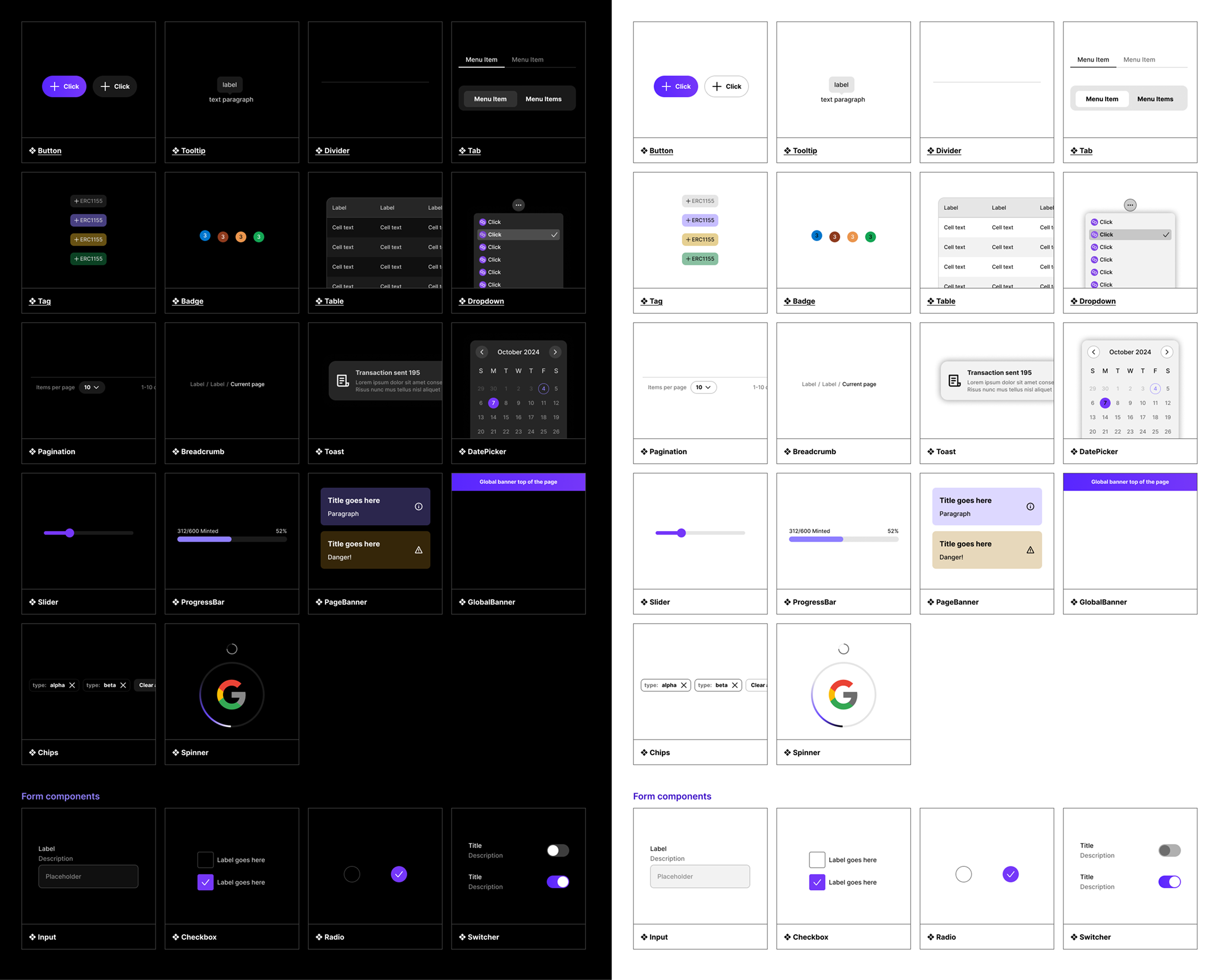
Sequence
UI/UX
Design System
Leadership
Standardizing UI foundations to reduce design drift and improve developer handoffs
Read case study
→
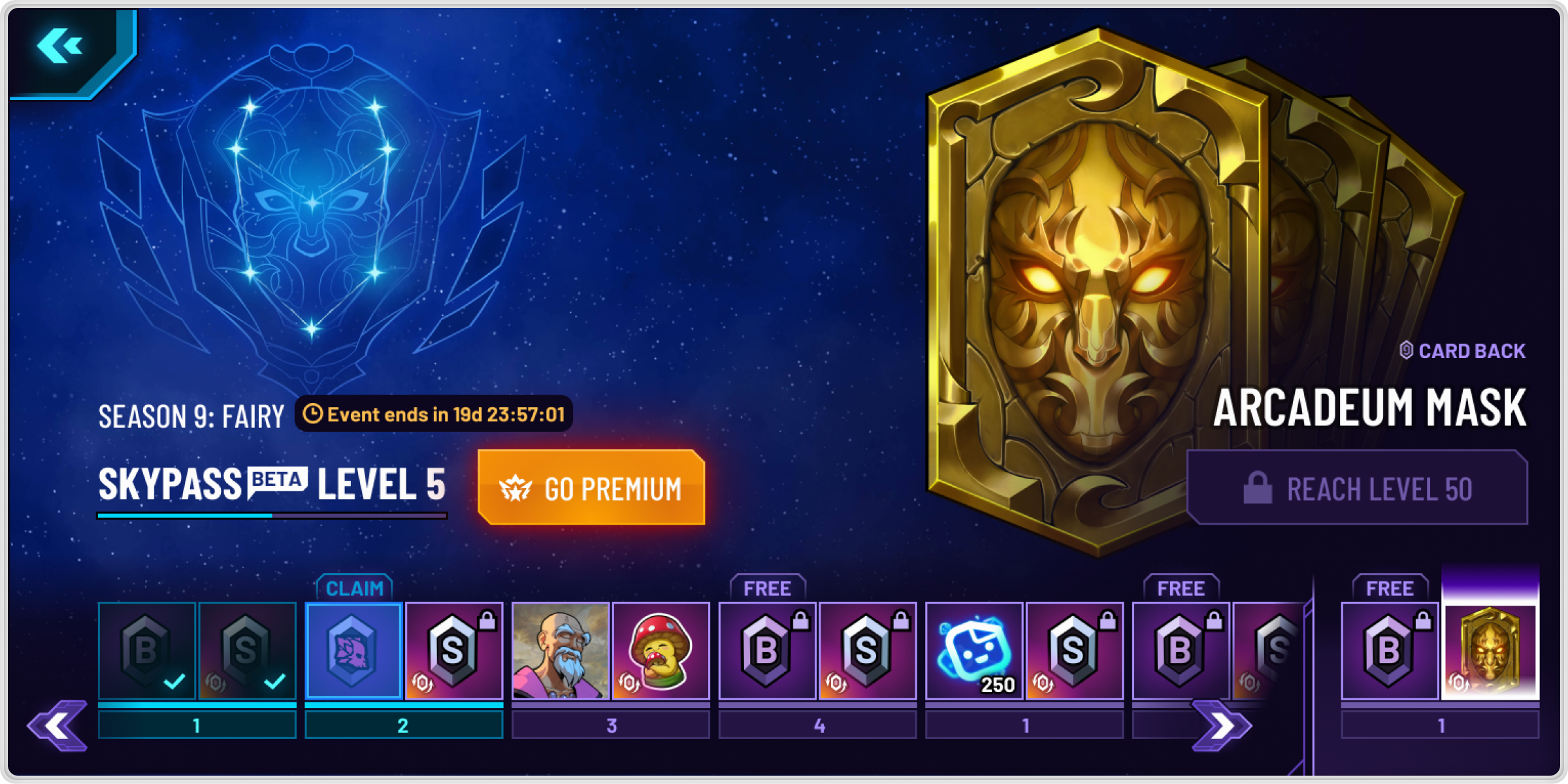
Skyweaver
UI/UX
Strategy
User Research
Turning unclear progression into a gamified system to drive retention
Read case study
→
Principles behind my work
🤝
Shared ownership. I believe the best work comes from collab. I bring people into the process early so we can craft the story together.
⚡
I move fast. Speed helps unlock thinking. I sketch, and prototype to test ideas quickly and keep the momentum flowing.
🗣️
I champion the user. I help teams stay grounded in real user needs. I like to test, listen, and learn from actual users.
🚀
How we work shapes what we ship. I help teams work efficiently through shared understanding and thoughtful communication.
🧠
I think holistically. I like to zoom in & out and understand how things fits into the bigger picture for the user and the business.
🌱
I don’t get attached. I treat design as a tool for iterative testing. I explore multiple paths, and I’m quick to pivot.
What people say about working with me
”Daniel is a creative powerhouse. A rare blend of vision, skill, and determination. He can take any design and make it better, all while giving you thorough and thoughtful feedback.”
Matthew Shera
Assoc. Game Director at Anomaly
”Very impressed with his ability to find levers to optimize our conversion rates and offer the best UX experience at the same time… very fast at generating new designs for specific needs”
Alexis Dollé
Head of Growth at Mailbird
”His design carries a lot of care, precision and effectiveness. And all of that comes through his constant research on the field… Daniel is the kind of professional everyone’s looking for.”
Tárik Quintans
Principal Product Designer at Dext
Full-stack designer shaping human-centered products through strategy, systems, and storytelling.
Product designer with 10+ years in startups and SaaS, owning the full design process from early research to high-impact experiences.

Sequence
UI/UX
Design System
Leadership
Standardizing UI foundations to reduce design drift and improve developer handoffs
Read case study
→

Skyweaver
UI/UX
Strategy
User Research
Turning unclear progression into a gamified system to drive retention
Read case study
→

Principles behind my work
🤝
Shared ownership. I believe the best work comes from collab. I bring people into the process early so we can craft the story together.
⚡
I move fast. Speed helps unlock thinking. I sketch, and prototype to test ideas quickly and keep the momentum flowing.
🗣️
I champion the user. I help teams stay grounded in real user needs. I like to test, listen, and learn from actual users.
🚀
How we work shapes what we ship. I help teams work efficiently through shared understanding and thoughtful communication.
🧠
I think holistically. I like to zoom in & out and understand how things fits into the bigger picture for the user and the business.
🌱
I don’t get attached. I treat design as a tool for iterative testing. I explore multiple paths, and I’m quick to pivot.
What people say about working with me
”Daniel is a creative powerhouse. A rare blend of vision, skill, and determination. He can take any design and make it better, all while giving you thorough and thoughtful feedback.”
Matthew Shera
Assoc. Game Director at Anomaly
”Very impressed with his ability to find levers to optimize our conversion rates and offer the best UX experience at the same time… very fast at generating new designs for specific needs”
Alexis Dollé
Head of Growth at Mailbird
”His design carries a lot of care, precision and effectiveness. And all of that comes through his constant research on the field… Daniel is the kind of professional everyone’s looking for.”
Tárik Quintans
Principal Product Designer at Dext
Full-stack designer shaping human-centered products through strategy, systems, and storytelling.
Product designer with 10+ years in startups and SaaS, owning the full design process from early research to high-impact experiences.

Sequence
UI/UX
Design System
Leadership
Standardizing UI foundations to reduce design drift and improve developer handoffs
Read case study
→

Skyweaver
UI/UX
Strategy
User Research
Turning unclear progression into a gamified system to drive retention
Read case study
→

Principles behind my work
🤝
Shared ownership. I believe the best work comes from collab. I bring people into the process early so we can craft the story together.
⚡
I move fast. Speed helps unlock thinking. I sketch, and prototype to test ideas quickly and keep the momentum flowing.
🗣️
I champion the user. I help teams stay grounded in real user needs. I like to test, listen, and learn from actual users.
🚀
How we work shapes what we ship. I help teams work efficiently through shared understanding and thoughtful communication.
🧠
I think holistically. I like to zoom in & out and understand how things fits into the bigger picture for the user and the business.
🌱
I don’t get attached. I treat design as a tool for iterative testing. I explore multiple paths, and I’m quick to pivot.
What people say about working with me
”Daniel is a creative powerhouse. A rare blend of vision, skill, and determination. He can take any design and make it better, all while giving you thorough and thoughtful feedback.”
Matthew Shera
Assoc. Game Director at Anomaly
”Very impressed with his ability to find levers to optimize our conversion rates and offer the best UX experience at the same time… very fast at generating new designs for specific needs”
Alexis Dollé
Head of Growth at Mailbird
”His design carries a lot of care, precision and effectiveness. And all of that comes through his constant research on the field… Daniel is the kind of professional everyone’s looking for.”
Tárik Quintans
Principal Product Designer at Dext